
Decreasing Furniture Waste Through Community
A mobile & web app tackling fast furniture, furniture waste & homeware accessibility.
Overview
Team
This project was an individual project where I managed all aspects of the UX and UI process, from research, to sketches, to wireframing, to branding.
Problem Space
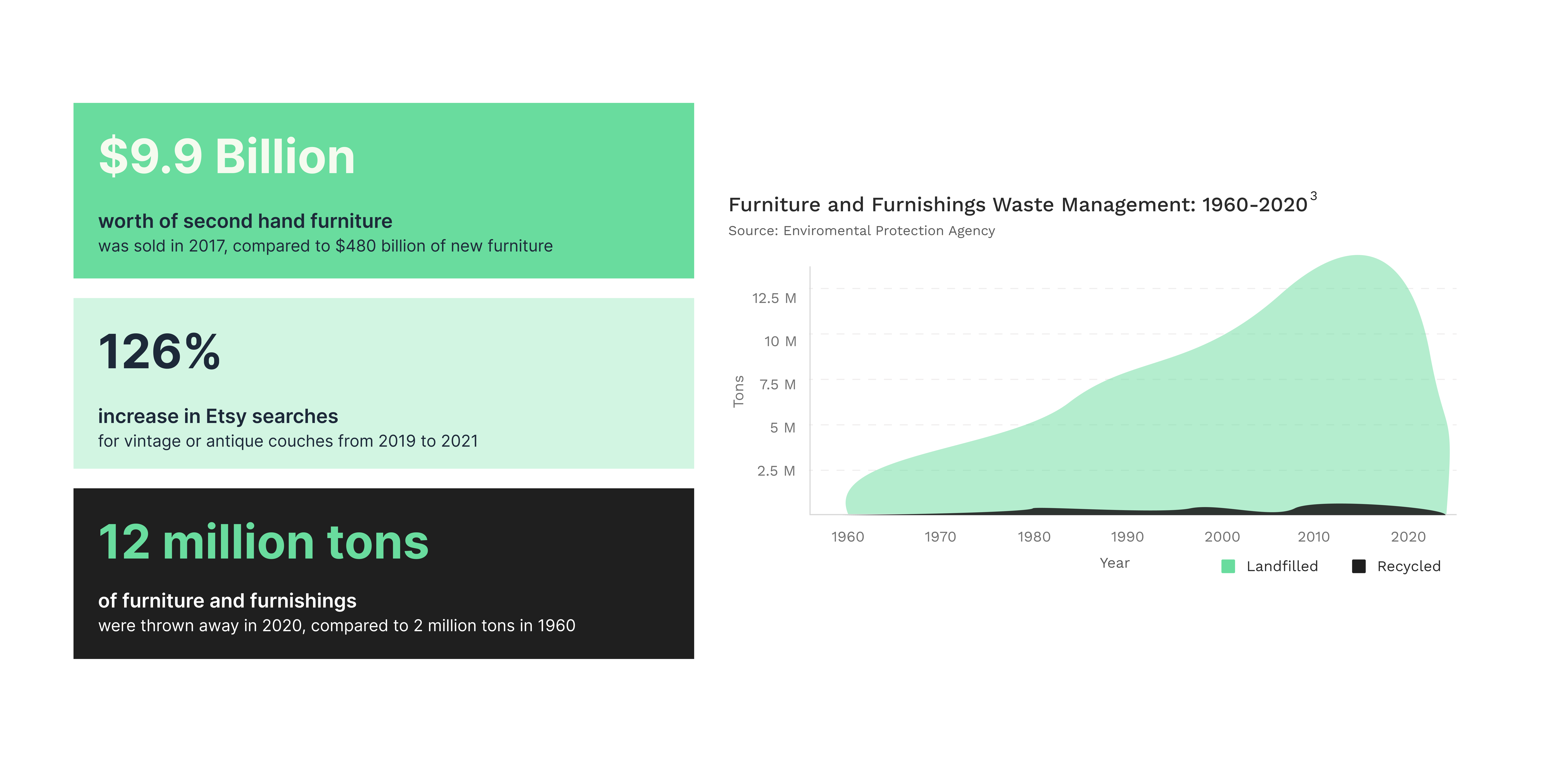
Fast furniture is a growing problem globally. According to the EPA, 9 million tons of furniture are tossed away every year in the United States alone. This amounts to more than 5% of all furniture bought in a given year.
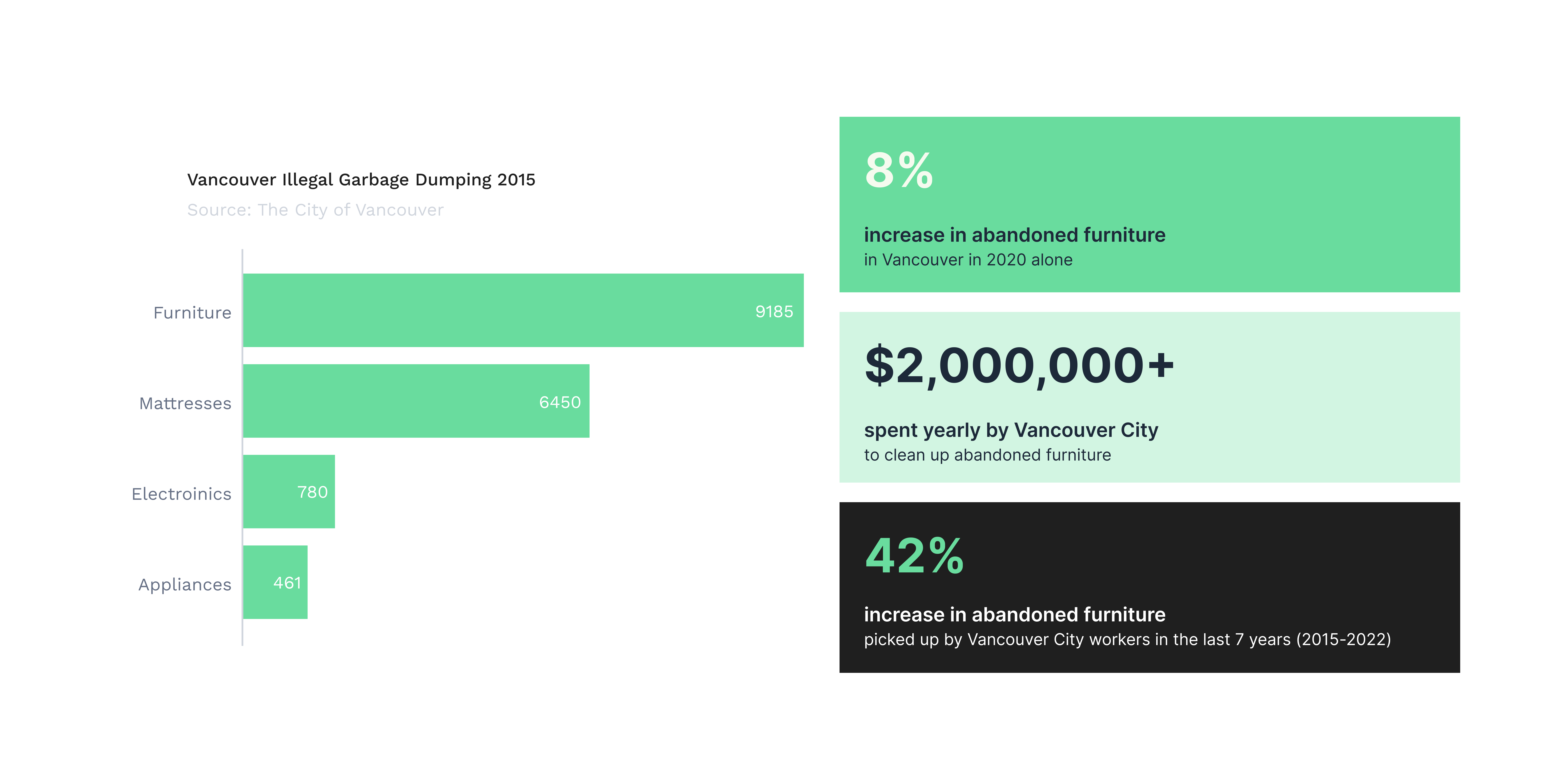
Canada doesn’t track the amount of furniture that ends up in landfills, however, the City of Vancouver alone says it gets about 20,000 calls about furniture dumped on city property every year, a number that’s nearly doubled in the last five years. Tony Walker , professor at Dalhousie University’s School for Resource and Environmental Studies, explains well why fast furniture is such an issue.
And as with anything we affix with the word “fast” – fast food, fast fashion and now the term fast furniture – there’s an over-exploitation of resources, precious minerals, metals, forestry products, to make the product. And then you’ve got another issue at the end of life. Most of it just gets thrown out.
Secondary Research
Through primary and secondary research, I hoped to better understand furniture purchase habits and furniture discarding habits of renters born from 1990-2005, as well as what barriers they face to accessing affordable and adequate furniture for their living spaces.
Firstly, looking at North America:
Now, looking specifically at Vancouver, Canada:
Primary Research
Survey
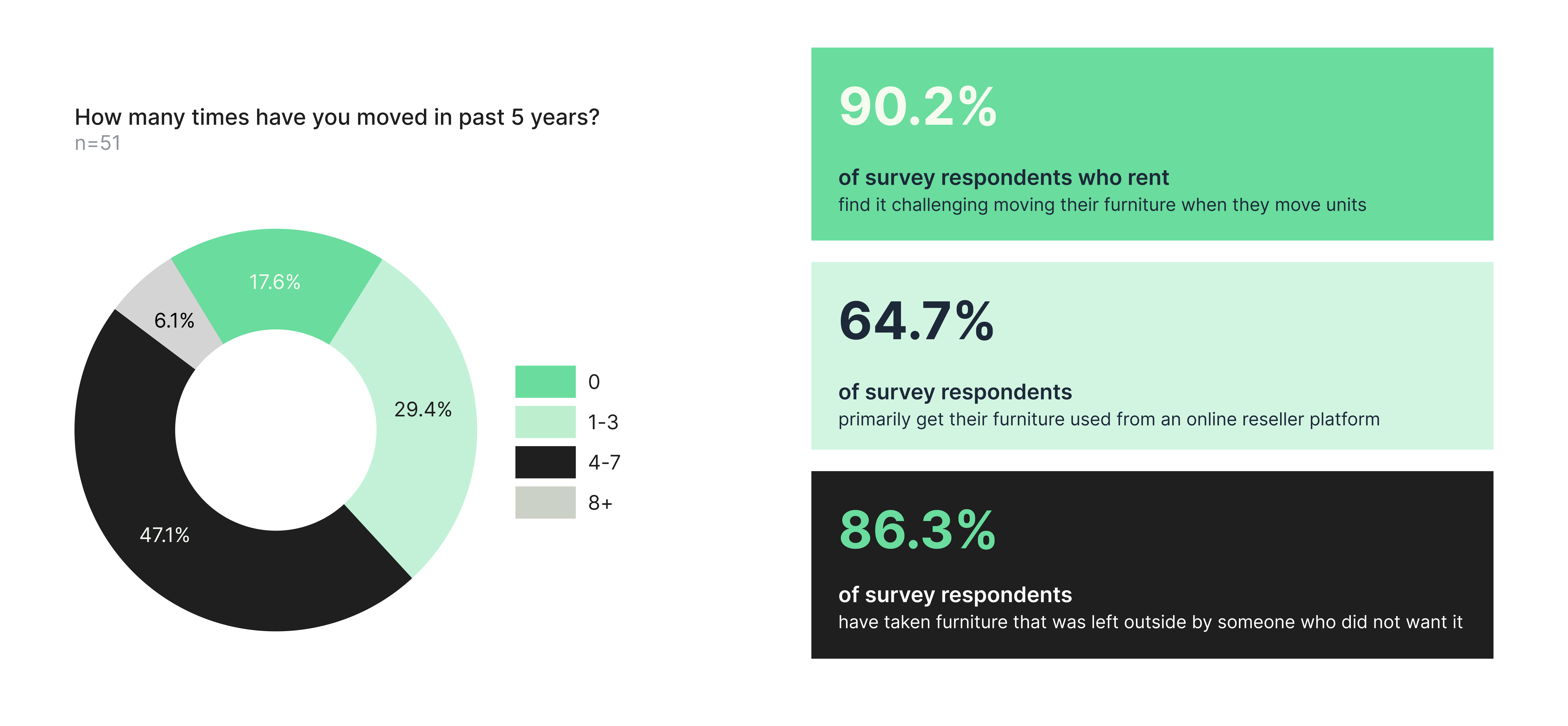
An online survey was used to gain broad insights from a wide range of individuals related to furniture purchase and selling habits.
Interviews
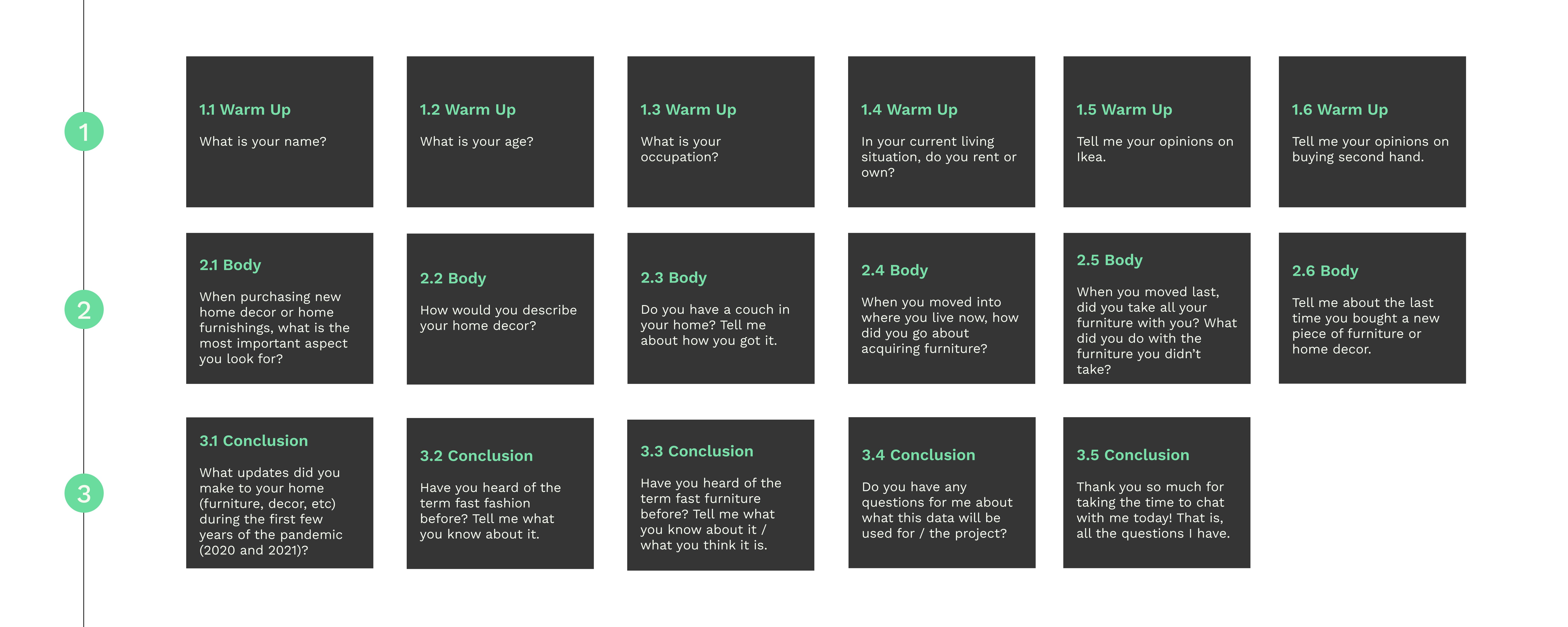
In-person interviews were conducted with five participants who all currently rent where they have lived, were born between 1990-2005, and have moved at least once in the past two years.
.png)
Affinity Mapping
Insights
- When looking to obtain furniture, individuals are heavily focused on the price that they will pay and are content with getting something in moderate condition for a lesser price.
- Renters are frequently moving from place to place which results in the need to obtain and get rid of furniture quickly and in a cost-effective manner.
- Millennials and Generation Z are highly aware of the degrading effects of capitalism on our environment and frequently opt to get items second hand to avoid further depletion of natural resources that would come with purchasing new items.
How Might We Question
How might we make it easier for individuals who want to discard their furniture connect with individuals who would gladly take that furniture so that the furniture does not end up in a landfill or get ruined from sitting outside in the elements.
Persona
Experience Map
In this experience map, we will explore the steps of our persona, Alex, looking for furniture items on Facebook Marketplace for a unit they have recently moved into. From the research, this seems to be the most common way that the target user group buys and sells their furniture, and interviews show that when moving, they are looking to acquire items fast and cheap.
Key Learnings
Millennials and Generation Z make up a significant portion of renters, and a significant portion of these groups also do rent. With the rental market, comes frequent moving, acquiring furniture, and getting rid of furniture. Fast furniture is not aligned with this demographic’s purchase habits, and they would prefer to get more unique pieces that will stand the test of time.
Execution
User Stories
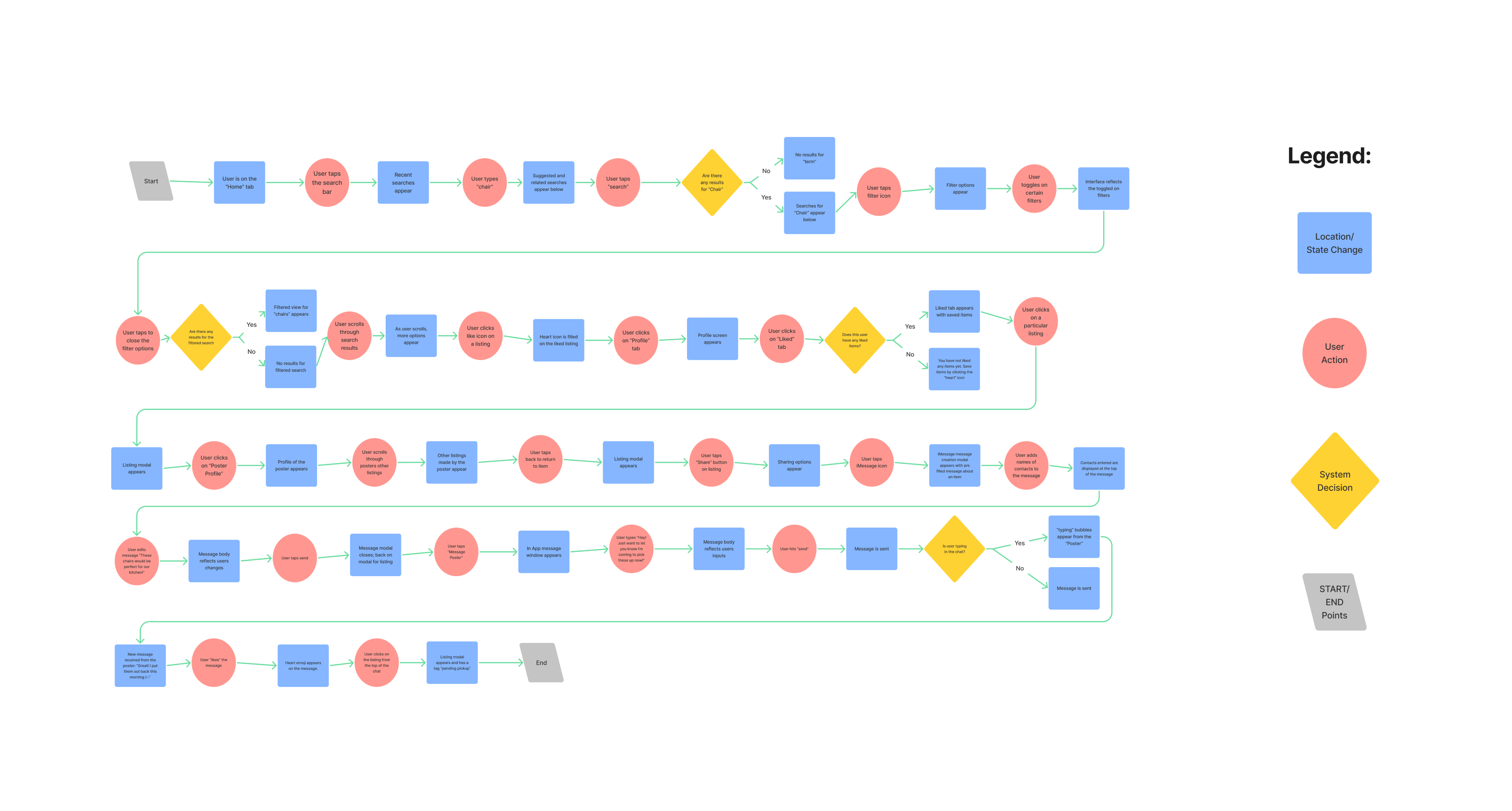
Task Flow Diagram
From the perspective of a user seeking furniture the main epic that will be focused on is browsing available items, and the related epics that will happen within this epic such as saving an item and viewing a user’s profile. The action of browsing for items is one of the most important features of the app, because this is how users will be able to know about and to acquire the furniture that is available.
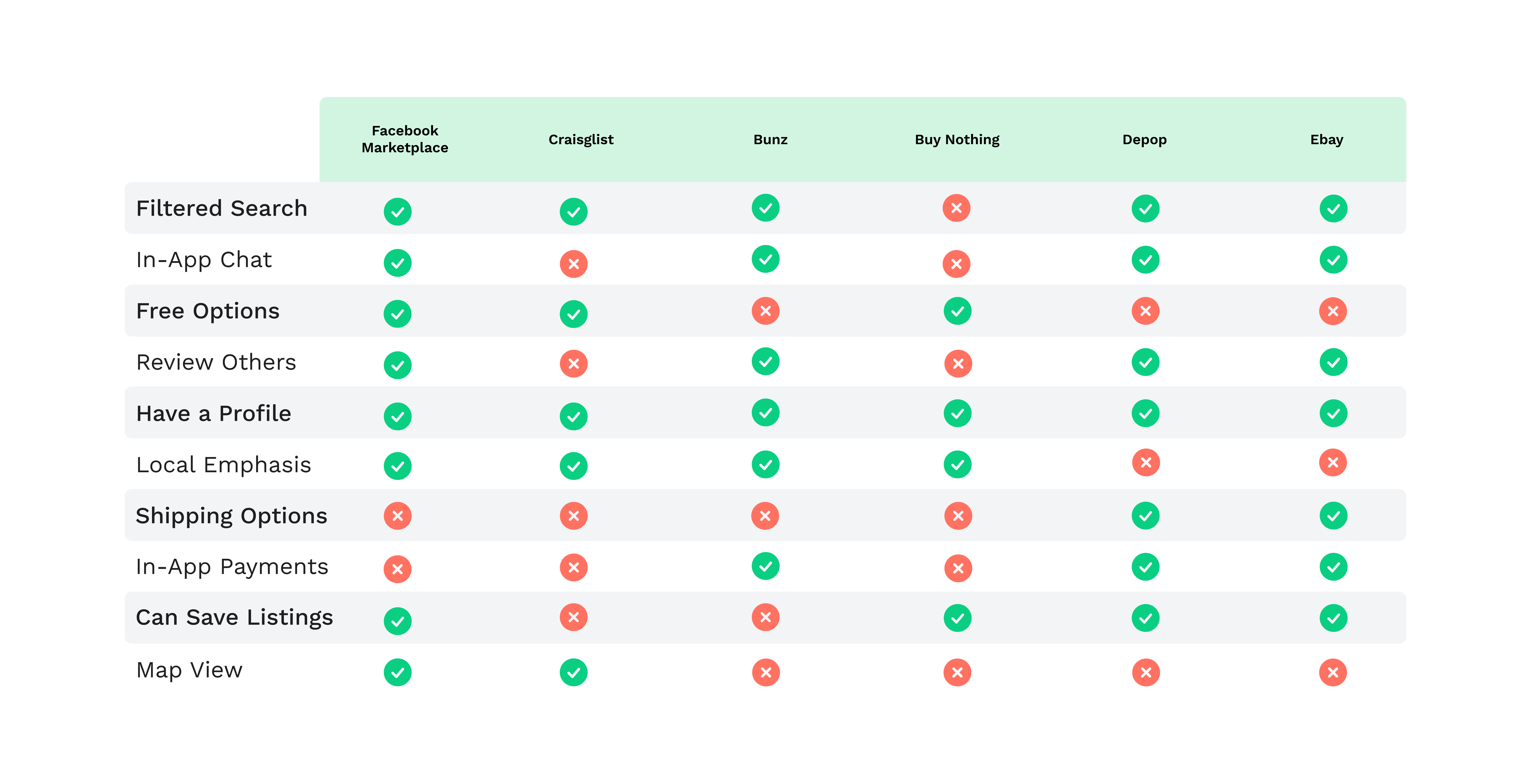
Competitor Feature Analysis
UI Inspiration Board
.png)
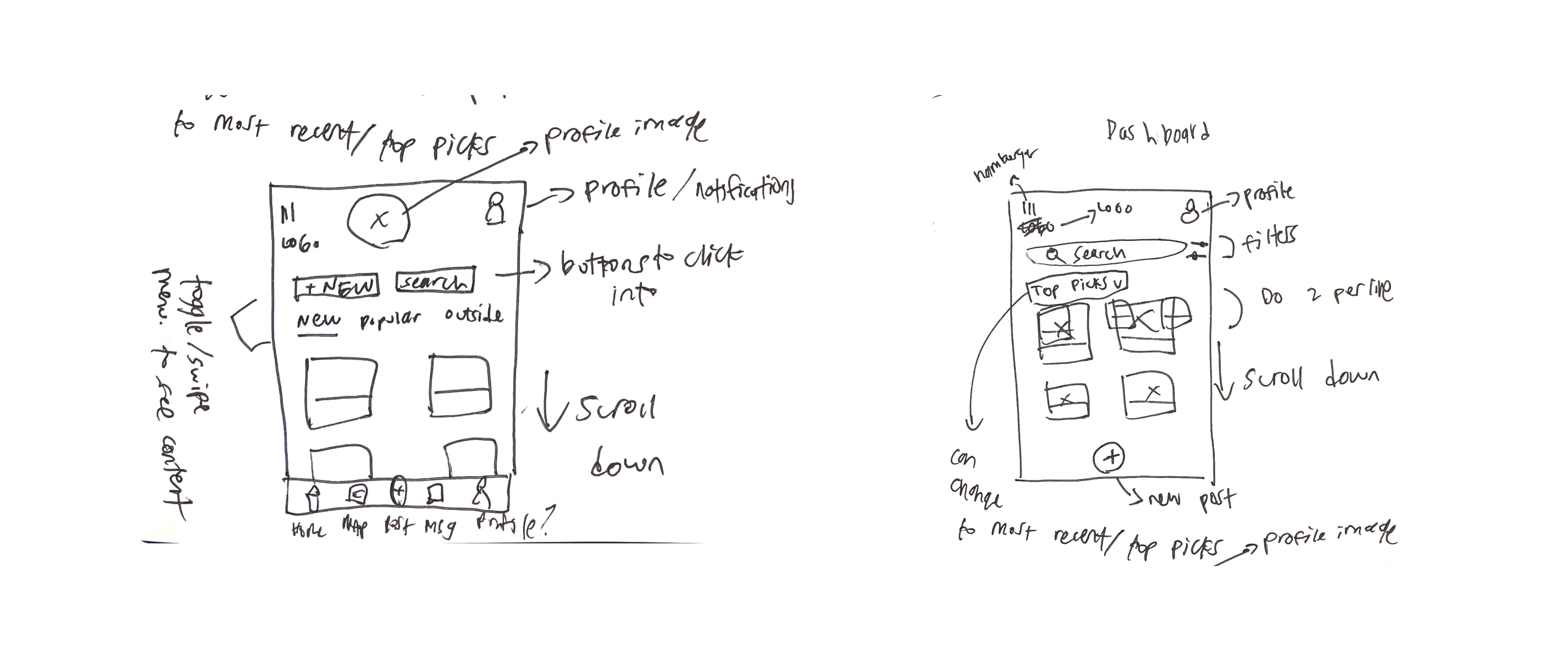
Initial Sketches
.png)
.png)
.png)
.png)
.png)
Refined Sketches
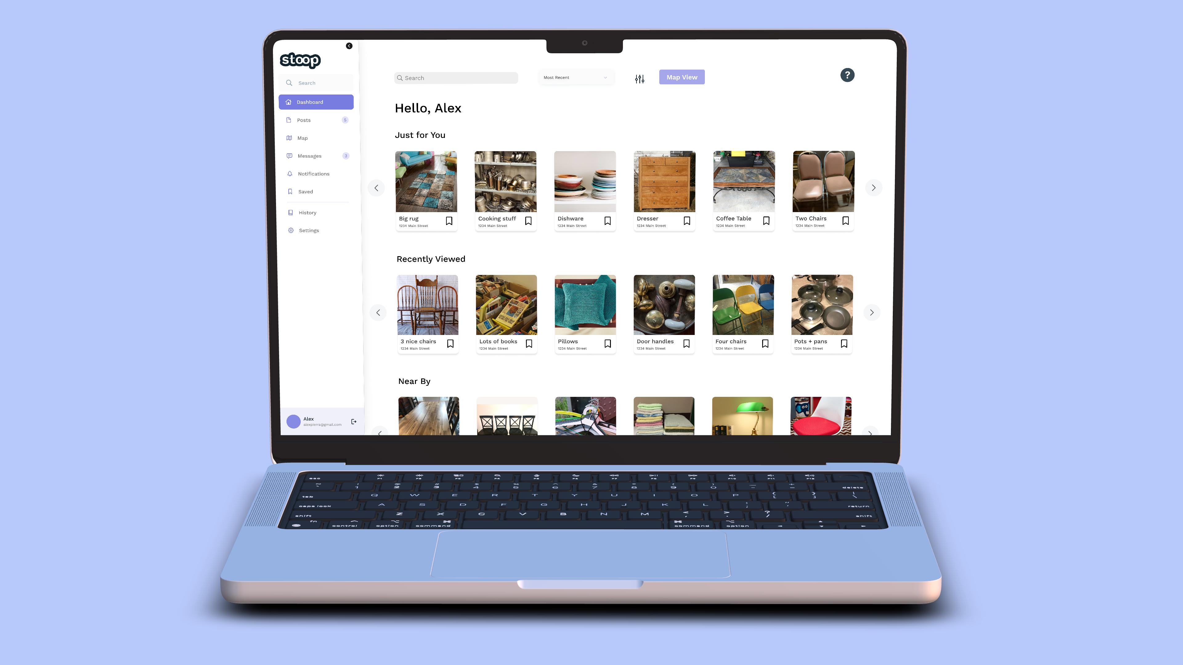
Home Screen
The home screen will be where users land when they first open the app. It will be a feed of items that can be sorted by top items or most recent, and will include a search bar and the option to filter results. Users can like/save items by clicking the heart icon on the post, and can view more about the listing by clicking on it.
.png)
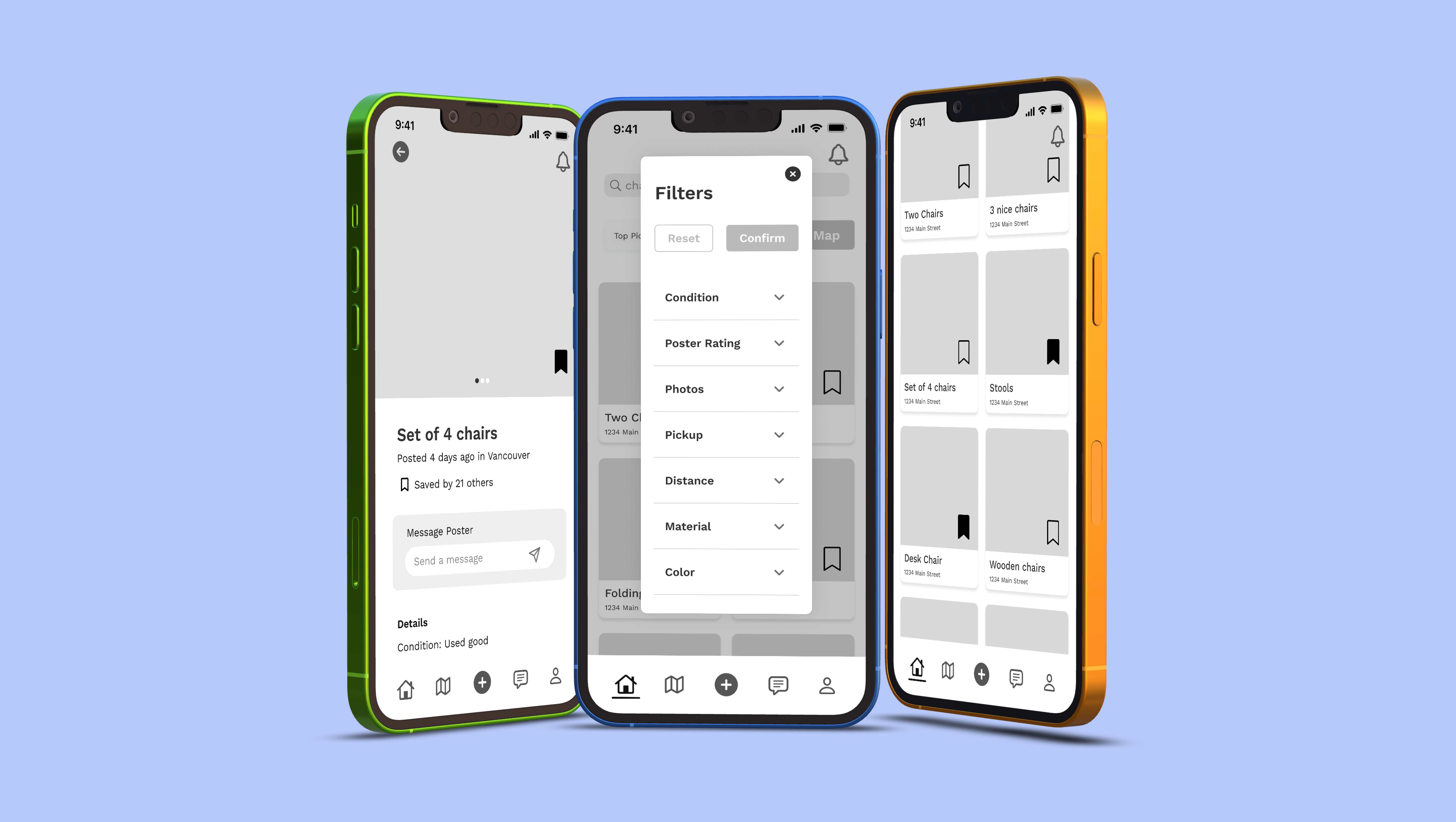
Listings and Map View
The map view will be a great place for users to be able to find out listings that are in a close proximity to them. They can navigate the map with typical actions such as dragging, pinching to zoom in and swiping to zoom out. The bottom of the screen will have the listings seen on the map ordered in distance closest to the users pin, first.
.png)
Profile
The profile page will look different for a user’s own profile and a user looking at another’s profile in app. Users will be able to upload a profile picture, a cover photo and add a bio. Additionally, they can see how many followers they have, how many they are following, and how many posts they have made. They can view the posts and saved content on this page
.png)
Chat
The in-app chat will be important for users to be able to contact each other regarding picking up certain available items. There will be a time displayed when a message is delivered and read, and users will also be able to react to messages, similar to other messaging platforms.
.png)
Post Detail
The post detail page will look similar to the post detail page on Facebook Marketplace. Users can scroll through the photos the poster has uploaded, see how many others have saved the listing, and message the seller from this page. Additionally, they can read more details about the listing, see the map view, and see related listings.
.png)
Saved Listings
The saved section of the app will function similarly to the saved section of the Instagram app where users can categorize saved items, but also view all the items they have saved. Users can access this section from the profile page.
.png)
Initial Greyscale Wireframes
The first prototype follows a flow where the persona, Alex Pierra, searches for chairs for her to use in the dining room of her shared home. Alex uses filters to narrow down her search and the “like” option to select which of the results she wants to come back to. She chooses which listing is her favourite, navigates to the detail page for the post, and messages the seller.
Expand the Greyscale Wireframes V1
Expand the Greyscale Wireframes V2
Expand the Greyscale Wireframes V3
User Testing
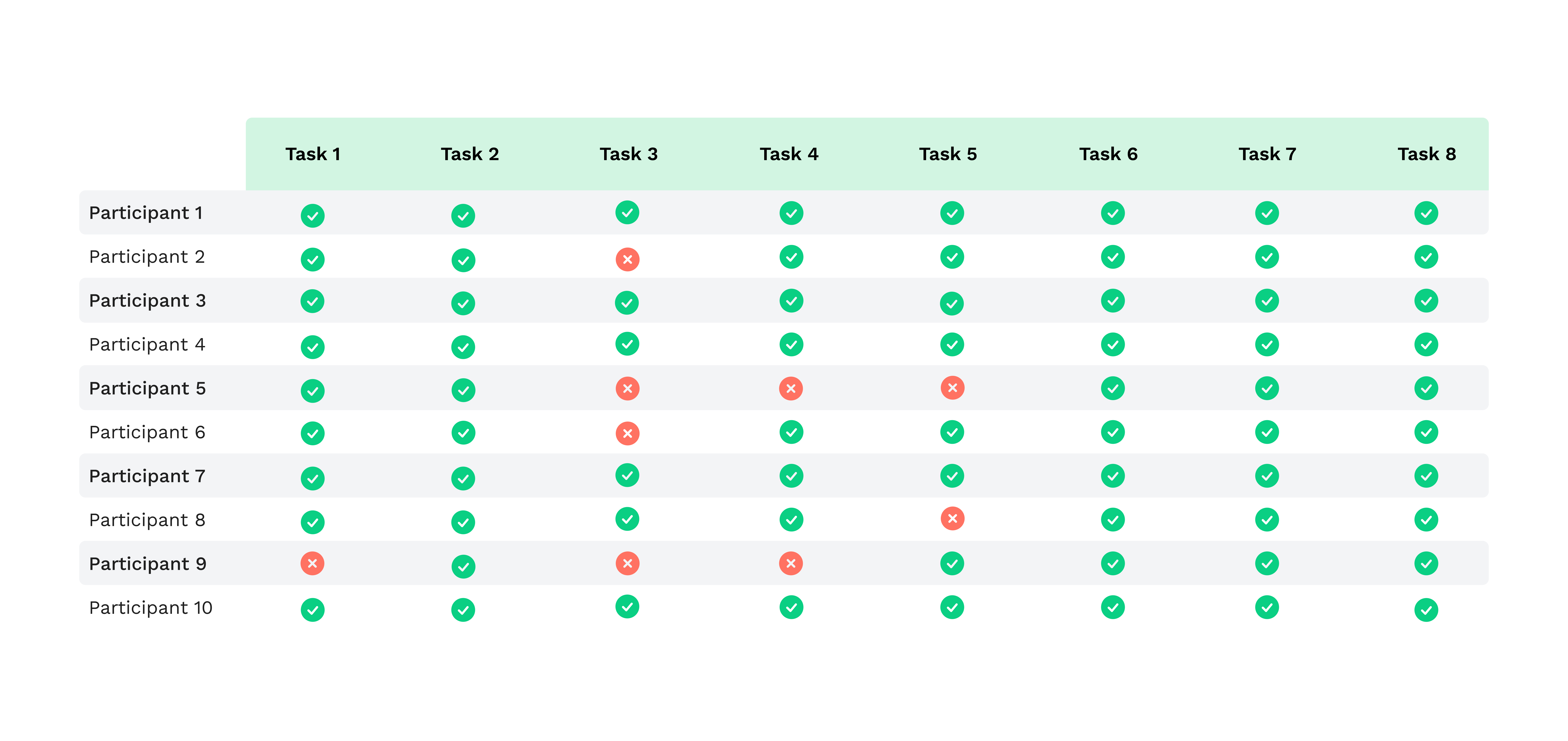
For user testing, users were tested on the task flow detailed in previous slides. A total of 10 users were tested for the first round, with half being tested on Maze and the other half being tested in person. Users were asked to go through the prototype as the persona, Alex, and given background detail on her demographic and behavioural attributes.
Tasks for Testing
- Open the app called “Stoop”
- Tap into the search bar and search for chairs
- Filter the search based off 5 given conditions: a) Condition: New, Like New, Used good, Used fair; b) Photos: Has photos
- “Like” the following three results: a) 3 nice chairs; b) Set of 4 chairs; c) Wooden chairs
- Go to your liked items and click on the listing for “3 nice chairs”
- Go to the poster’s profile and click the button to send them a message
- Send the seller a message and wait for their reply
- Navigate back to your profile page
Round One
Results
.png)
Insights:
- User tests showed that some parts of the wireframe had text that was too small resulting in it being difficult to read for some users. Specifically, small text was an issue on the search results and the profile pages.
- The placement of the filter icon caused confusion among users because they mistook it for a hamburger menu icon. While the icon chosen is considered a standard icon for filter indication, its placement resulted in confusion over its purpose.
- When users were selecting filters, they wanted to see a confirm button to lock in the filters they had selected, rather than just clicking the “x” to close the filter window.
.png)
Changes Made
.png)
.png)
.png)
.png)
Summary
The first round of user testing was ultimately successful as most users were able to navigate the app with ease. However, certain issues such as icon placement, text size, and having buttons to confirm actions impeded and confused some users from completing all tasks.
Round Two
After updating the wireframes based off the feedback from round one testing, 10 new testers were selected to test the usability of the updated prototype. The same scenario and general test format was used to be able to control for the changing variables within the prototype.
Tasks for Testing
- Open the app called “Stoop”
- Tap into the search bar and search for chairs
- Filter the search based off 5 given conditions: a) Condition: New, Like New, Used good, Used fair; b) Photos: Has photos
- “Save” the following three results: a) 3 nice chairs; b) Set of 4 chairs; c) Wooden chairs
- Go to your saved items and click on the listing for “3 nice chairs”
- Go to the poster’s profile and click the button to send them a message
- Send the seller a message and wait for their reply
- Navigate back to your profile page
Results
.png)
.png)
Insights:
- Even though the filter icon was moved, users were still confused by the appearance of the icon and did not recognize it immediately as an icon to toggle the filters. It will be necessary to update the icon to something users would recognize more quickly. However, the updated placement of the icon did decrease some of that confusion compared with the first round of testing.
- Within the filter options window, users found that the size of the checkboxes was too small for mobile, resulting in more misclicks than anticipated. Utilizing collapsable dropdown menus for the filter options would be a better way to show all the information on screen, and allow the checkboxes to be bigger.
- Individuals were confused the purpose of a “heart” icon and a “like” feature because this app was not for social networking. Since the action performed the same purpose as a save interaction, users stated they would prefer this instead of the heart.
.png)
Changes Made
.png)
.png)
.png)
.png)
.png)
Summary
After the initial issues with the prototype had been updated from the first round, the second round of testing went much smoother and less people had issues with navigating the task flow. However, there were some issues that came to light such as the size and business of the filter modal, the like feature (as opposed to a save feature) and the icon for opening the filter modal.
Results
Branding
geometric, outside, connected, carefree, community, home, fresh, nature, soft, textured, diverse, cool, laughter, foliage, material, abstract, friendly, unpredictable, open, flow, regenerate
Moodboard
I explored geometric patterns and shapes, as well as natural colours
.png)
App Name
I chose this name for my app because I was inspired by an Instagram account, @stoopingnyc, where the admins document free items found outside on the streets in New York City. The action of looking for free things outside on the streets has acquired the name “Stooping”, thus the name for my app, Stoop.
Wordmark
.png)
.png)
.png)
Color
.png)
.png)
App Icon
.png)
.png)
I chose this icon for my app because it embodies all the brand elements I have created, thus allowing the icon to be easily recognizable to the user when they see it. I want all elements of the branding to tie together, from the app to the website to the icon.
Hi-Fi iOS App Wireframes
From the perspective of a user seeking furniture the main epic that will be focused on is browsing available items, and the related epics that will happen within this epic such as saving an item and viewing a user’s profile.
Click to Expand the Hi-Fi Prototype
.png)
Hi-Fi Web App Wireframes
The Stoop web app gives users all the same capabilities as the mobile app, and then some! With a larger viewport, more information is able to be displayed at once, making the interface less cluttered and more organized. The flow displayed on the right is a condensed version of the mobile flow.
Marketing Website
The Stoop marketing website homepage was designed to be cohesive with Stoop’s brand, as well as highlight the reasons a user would want to try the app. The desktop version utilizes hover and pressed states on buttons and some cards. The mobile version of Stoop’s marketing website encompasses the same information, but reorganized to be digestable on a mobile viewport. Certain elements were condensed or rearranged to be able to display the same content for a much smaller screen.
View the desktop site on Figma
.png)
Key Learnings
Through the process of creating a prototyped app from the ground up, I learned about how much work goes into the process of UI and UX design, but also how much I really enjoy it. From sketches, to user stories, to hi-fi design, I was able to work on all aspects of the design process from start to finish.
Next Steps
The next steps would be to user test the hi-fi design, the web app, and the marketing website, and then make a few more updates to the wireframes. Additionally, I would want to design out more screens and features that were not able to be accounted for in this project.
Sources
- Tackling a Multi-Million-Ton Furniture Waste Problem
- Used furniture is about to become a $16.6 billion business
- The Golden Age of Free Stuff Is Upon Us
- Global $16.55 Billion Off-the-Shelf Second Hand Furniture Market, 2017-2025
- Google Trends: Vintage, Second Hand, Antique, Mid Century Modern, Facebook Marketplace
- THE STATE OF CONSUMER SPENDING: Gen Z Shoppers Demand Sustainable Retail
- Facts and Figures about Materials, Waste and Recycling: Furniture and Furnishings
- Metro Vancouver warns against illegal dumping if Spring cleaning
- Vancouver has a $2M illegal dumping problem, and it’s only getting worse
- Illegal dumping in Vancouver grows by 40%
- Environmental Impacts of Fast Furniture
- Stooping NYC: One Person’s Trash is Another One's Treasure
- Call it used, call it pre-owned—it’s the furniture that’s selling
- Why We Love Second-Hand Furniture
- Fast Furniture Is an Environmental Fiasco
- Fast furniture doesn’t have the same poor reputation as fast fashion, but it should
- How to Avoid Fast Furniture and Minimize Waste
- Millennials Are Choosing Vintage Furniture Over Fast Furniture In The Name Of Sustainability
- The Furniture Resale Business Is Ripe For Disruption
- One Business That’s Loving the Supply Chain Crisis: Upholsterers
- Consumers are finding that secondhand furniture is both sustainable and available
- Images from Pexels
- Mockups from Deviceframes
- Maze for User Testing